How to Build Comparison Pages [with Examples!]

The SaaS industry is overwhelmingly competitive and incredibly saturated. There’s no getting around that, so when you’re building up a client base for your new tools, you need to find more ways to stand out.
You’ll likely do competitor research to find out how you measure up against the competition. Still, then you need actually to leverage that information to drive trial sign-ups, book demos, and close on new sales.
That’s where comparison pages come in. Comparison pages are an outstanding way to showcase what you can offer and why potential users should choose you.
In this post, we’ll look at how to build comparison pages (and lots of examples!), and go over how to drive more traffic to them.
What Are Comparison Pages?
Comparison pages are dedicated site pages that compare your product to the competitors. In some cases, you may also see comparison pages that showcase different plans or packages that are all from a single company, too, but this post is going to focus on competitor comparison landing pages.
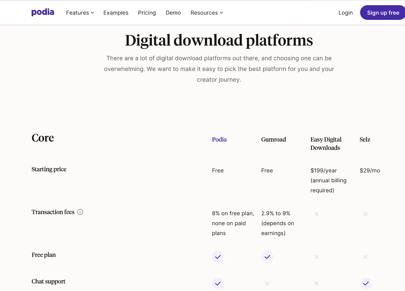
Here’s a great example from Podia, listing core information that users need for different top competitors in addition to their own offerings:
Why You Need Comparison Pages
Product comparison pages can play a crucial role in helping customers make informed decisions by giving users all the information they need at a quick glance… and in a way that highlights all of your strengths.
You can ensure that your comparison pages are organized to feature all your product’s best assets front and center, proving that you’re a superior choice compared to the competition.
Comparison pages should position you as a stronger option, and while you need to be honest, you can be selectively honest. You can highlight your strengths and just not quite feature your weaknesses extensively.
At the right point in the digital sales process, comparison pages make it easy for users to size you up and can convince them to convert.
Since B2B buying cycles are long on average and there are so many options on the market, comparing yourself to a few popular names (and positively!) can be the game-changer you need. That’s why so many large SaaS brands have multiple product comparison pages on their sites.
5 Tips for How to Build Comparison Pages
When determining how to build product comparison pages that will get you clicks, leads, and sales, there are some best practices you want to keep in mind. Some are practically mandatory (like the first tip), while others are optional recommendations to consider.
Let’s take a look at the five most impactful tips for creating strong competitor comparison landing pages.
1. Focus On Key, High-Selling Features
Every brand has its own unique selling proposition (USP), with its own set of winning assets that set them apart.
You may have the best unique features utilizing top-of-the-line tech that no one else offers yet. Or you may have a more expansive array of features or a stronger interface.
High-selling features of your product may also include things like your pricing models and costs, or even the fact that you have the best round-the-clock customer service.
Whatever your best-selling features are (and whatever sets you apart from the competition) should be featured at the top of your comparison pages.
In the example below, ClickUp details how they offer specific features for free that Asana (one of their biggest competitors in the project management space) charges for. They show that there are some free features on Asana but that they offer much more.

While price may not be the only reason customers choose to purchase with you, it’s often a good idea to include pricing information near the top of your comparison page. For many, it at least influences the buying decision, and it should be highly visible.
2. Break Features Down Into Different Sections
One common tactic for building product comparison pages that will appeal to potential customers is to break the information down into distinct sections. This makes it exceptionally easy for users to scan the pros and cons of different competitors so they can get the information they need.
Comparison charts can take different formats. Some, like Pondia, will have sections of different information like “Core” information in addition to “Sell” and “Market” almost like headings, with unique features listed under each.
Others, like this product comparison page example from HubSpot, may have a smaller and more concise comparison table that has an entire “section” in a single line. This is a more dense comparison chart, but also can get the point across quickly.

There’s also the option to have competitor comparison landing pages that compare your brand to a direct competitor in more long-form content. We’ll talk about this a bit more in the next section, but a good format here is to break down different categories into H2s or H3s and then define (ideally in bullet points) the core differences.
You can see an outstanding example from BambooHR here:

3. Consider Using Long-Form Content like Blogs
If you’re up against well-known and established competitors, you can use long-form content to snag some of your competitors’ customers. This allows for comprehensive comparison pages that review your brand against one or more competitors in-depth.
In addition to Podia’s magnificent library of product comparison pages, they’ve also got more long-form comparison reviews, which you can see here:

If certain topics are more complex, and especially if you’re looking at getting an entire company to adopt a tool instead of a single user, having a combination of short comparison charts and longer competitor comparison pages is a safe bet.
One can live as a landing page on your site (and a core destination throughout your funnel), and the other can be featured in a blog post.
And don’t be afraid to create individual comparison posts for each direct competitor; this offers a lot of potential when it comes to ranking for more keywords in the SERPs.
4. Think About Users’ Main Pain Points
When you’re creating SaaS comparison pages, you need to think about why your audience would choose your tool.
What problems can you solve that your competitors can’t?
Which pain points will be strongest for audience members that align with your ideal customer profiles (ICPs)?
There will be certain motivating factors that directly influence your audience’s buying decisions.
Small businesses, for example, are much more likely to be influenced by price, contract flexibility, and features like “code-free drag and drop.” They’re on a budget, they don’t want to be locked in, and you may have business owners doing a lot of tasks themselves.
Enterprise-grade companies, however, are likely to care more about advanced features, scalability, and potential customization options.
When you understand your audience, you can create much stronger comparison web pages that will hit home, both with the features you choose to highlight and the copy that appears above it.
This is a great comparison page example from Freshbooks that really speaks to who their audience is and what pain points they have:

5. Consider Featuring Customer Reviews
Customer testimonials are insanely powerful as a marketing medium, and they have a strong place in the digital sales funnel for SaaS brands.
The last thing an executive wants to do is to select a new tool that their entire team uses only to find out after adoption that customer service is abysmal or that there’s a security risk.
Some comparison landing pages will include customer testimonials; others focus heavily on testimonials to prove their worth to potential customers.
monday.com used this strategy in their comparison post against one of their competitors. It’s a different approach compared to other comparison charts that we’ve seen, because it focuses on benefits like ease of admin or setup exclusively from the customer review perspective. They show the total score and the number of reviews, all of which surpass their competition’s.

Social proof is a huge deal, so don’t underestimate it when you’re trying to surpass your SaaS competitors (and their competing products!).
How to Drive More Traffic to Comparison Pages
A great product comparison page is a huge asset for your SaaS brand, but only if people actually see it. Because of this, it’s important to know how to drive traffic to your product comparison pages by navigating on your site, through organic search, and with PPC campaigns that drive traffic from search engines.
First, ensure that your comparison pages are featured prominently on your site. Comparison charts can be added to “product” pages or pricing pages. They can also appear on their own page that you link to through core product pages.
If you’re creating separate comparison landing pages, it’s essential to ensure they’re well-optimized for SEO.
An easy strategy here is to create charts and comparison pages that focus on a single competitor. If I work for HubSpot, I may want to write comparison pages that are optimized for “Salesforce alternatives” and “HubSpot vs. Salesforce comparisons.”
This is what people may search for when trying to make a purchasing decision, and as you can see in the example below from Jasper.ai, you can use this content to rank well both in organic search and through Google Ads:

Once you have one web page up and running, it’s easy to use it as a comparison page template and then create multiple different options for each competitor. Loomly has pages (all well-optimized for SEO) for each major competitor.

Final Thoughts
If you’re looking at how to build comparison pages, the tips above are sure to help you get more customers. The most important part is thinking about what information your audience needs, and how thorough you’ll need to be.
Honest and comprehensive comparison pages are important, but knowing which information and features to highlight is key.
And remember that this is an art form as much as a science. That’s why some agencies like Stack Against focus exclusively on creating product comparison pages. Make sure that whether you’re designing them yourself or working with an agency, you’re testing your pages to see what works for you.
What do you think? Do comparison pages work for you? How do you build great comparison pages? Share your thoughts below!


