18 Best SaaS Product Page Examples

A SaaS product page has one main job: to attract and convert users who fit your ideal customer profile (ICP).
So how can you optimize a product page for this goal, whether you’re targeting free trials, product demos, freemium signups, or paid subscriptions?
From the messaging to the user experience (UX) to the features and benefits, you have to get the essential elements right.
In this article, we’ll look at 18 of the best SaaS product page examples and explore some of SaaS marketers’ top tips and lessons learned—so you can develop content that converts.
What to Consider When Building a SaaS Product Page
Although many SaaS product pages follow similar formulas, there’s no single template that applies across the board. To design a page that works for your SaaS, consider a few key factors.
Number of Buyer Personas
Does your product target one well-defined buyer persona? A single-page format that touches on your ICP’s pain points, challenges, and goals is probably ideal.
But if your product works for two or more buyer personas, you’ll need a different approach. Instead, split your page by buyer persona or link out to separate solution-focused pages for each ICP.
Category Awareness Level
If your category is already well-established, you can expect your ICP to understand the basics of your solution. Rather than focusing on what it does, highlight what it will help them accomplish (i.e., benefits).
However, if you’re building out a new category or marketing to a new user base, you’ll need to prioritize awareness and education. In that case, focusing on product features can be a smarter approach.
Product Complexity
Does your product include a long list of features, integrations, and workflows? Explainer videos and embedded demos can go a long way toward clearing up common questions and increasing conversions.
But for a relatively simple SaaS tool, you can probably avoid these lengthy explanations. Instead, focus on providing social proof and giving your target customer a clear reason to convert.
Split-Testing Potential
If you’re marketing to a niche audience, then your page traffic may never approach a volume where it makes sense to split-test different iterations. But if you have enough traffic, A/B testing can help you make dramatic improvements to key metrics.
For example, you might compare:
- Screenshots vs. explainer videos
- Interactive vs. on-demand product demos
- Leading with features vs. benefits
- Call-to-action (CTA) copy
- Single vs. multiple product pages
So how exactly can you improve your copy, UX, or CTA? Let’s look at some of the best product pages for B2B SaaS.
Single-Page SaaS Product Page Examples
These companies dedicate a single page to product—in some cases, completely integrating it into the homepage.
1. NeuronWriter
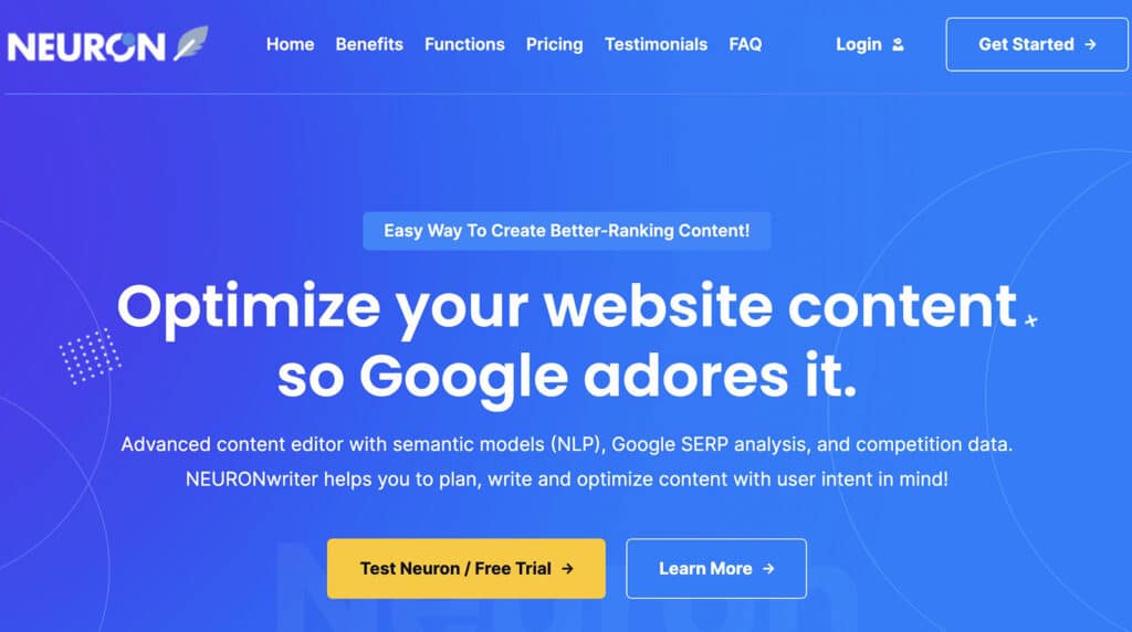
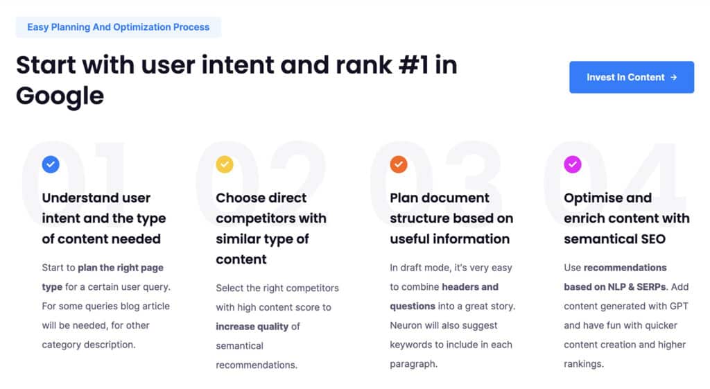
The NeuronWriter homepage essentially doubles as a product page. Yet this minimal approach still covers all the basics. Both the Benefits and Functions links in the navigation bar and the Learn More CTA button use jump links that help users learn about the content editor platform without leaving the homepage.
2. Datapad
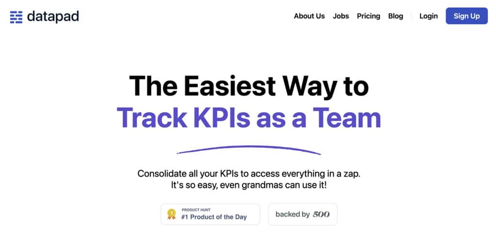
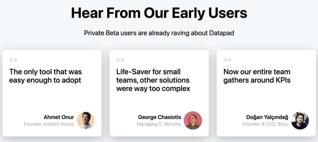
Datapad takes a similar approach with its single-page format. But in addition to leading with feature-backed benefits, the KPI tracking tool places social proof prominently throughout the page. In addition to the Product Hunt badge, the page showcases ratings and early user reviews.
3. Type
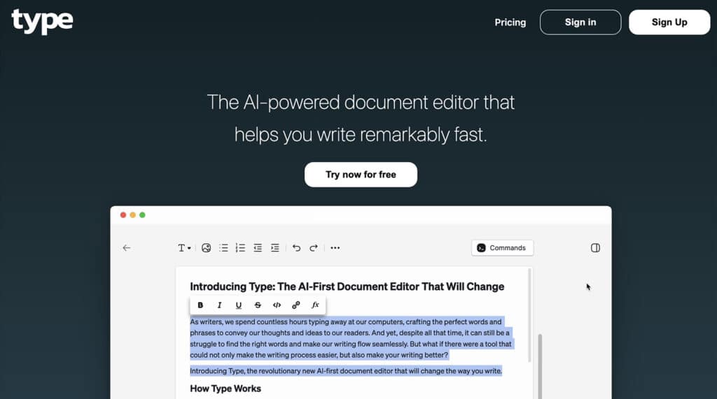
Easily the simplest product page on this list, Type leads with a concise 10-word description and a looping video that shows the AI-powered document editor in action. Although it might be too minimal for many SaaS companies, this approach aligns with the tool’s clean, uncluttered interface.
Multi-Page SaaS Product Page Examples
Have more than one buyer persona or use case you need to target? Take a look at these SaaS website examples.
4. Instrumentl
Grant writing platform Instrumentl has separate pages for its two ICPs: nonprofits and consultants. Each highlights buyer-specific use cases that detail the product’s unique selling proposition (USP).

Gauri Manglik, CEO and Cofounder of Instrumentl, explains: “In the past, we’ve tried to create one page that works for all our buyers—and it just doesn’t work. We’ve learned that each buyer persona has different needs and goals, and they need a page that speaks to those specific needs and goals.”

5. AdEspresso
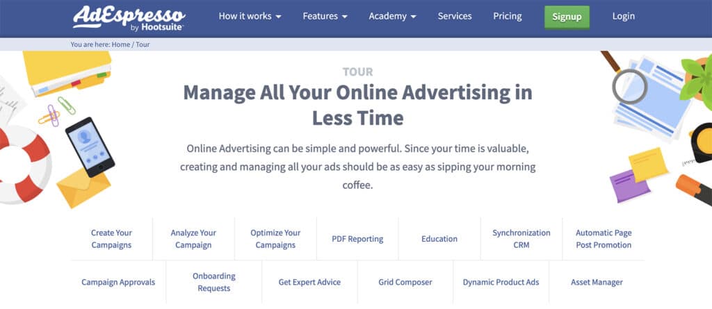
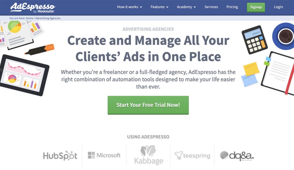
AdEspresso takes a hybrid approach. The advertising platform offers a product tour designed for all B2B buyers, but it also has separate pages for ad agencies, small businesses, and ecommerce companies. Each leads with persona-specific features and uses a trust banner to provide social proof.
6. SE Ranking
SE Ranking gives buyers even more options. The SEO platform has four product pages for key personas: enterprises, agencies, small businesses, and entrepreneurs.
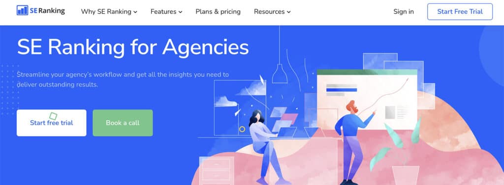
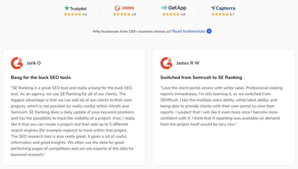
Each leads with persona-specific benefits, along with detailed feature descriptions, testimonials, and press features. Yet the site also has several dedicated feature pages, giving buyers multiple points of entry.
Benefits-Focused SaaS Product Page Examples
Want to show B2B buyers what they can accomplish with your product? Use these benefits-focused pages.
7. Salesforce
The Salesforce Sales Cloud product page hasn’t always led with benefits like “accelerate growth” and “sell faster, smarter, and more efficiently.” An agency partnered with Salesforce APAC to A/B test the CRM platform’s page—transforming it from a features-first page that targeted email captures to the current iteration pictured below.
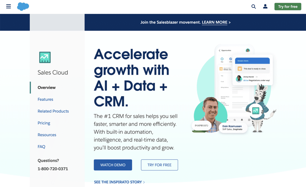
The partner agency, explains: “I would definitely recommend building SaaS product pages around the benefits that the product provides, rather than just listing the features. Features are just a list of technical details that may not be as appealing to customers. By focusing on benefits, you can make an emotional connection with the customer and increase the likelihood of a conversion.”
8. Breadcrumbs

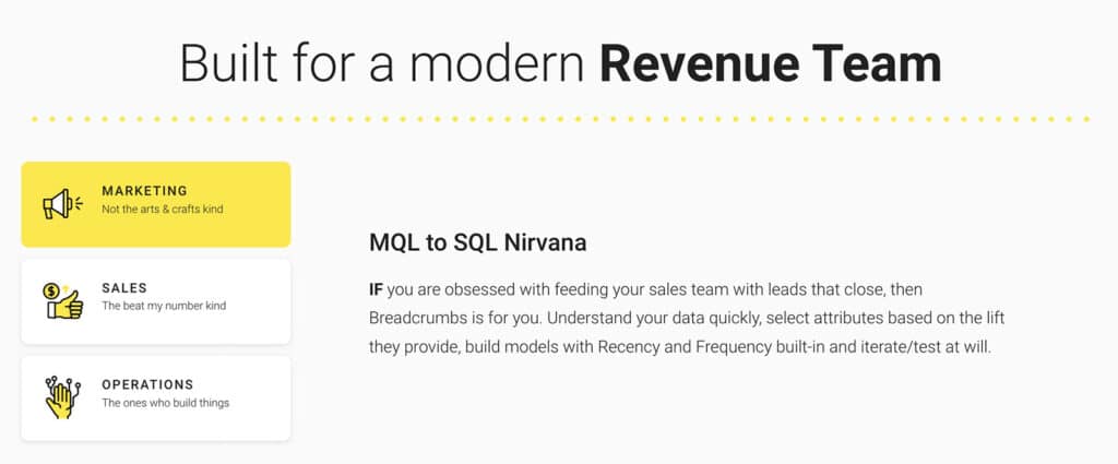
What’s a good way to frame the benefits of a B2B SaaS product? The Breadcrumbs product page uses benefits like “MQL to SQL Nirvana” to help B2B buyers imagine how the revenue acceleration platform can transform their workflow. In the header, the page uses an animated explainer video to introduce the tool in under 60 seconds.
9. Todoist
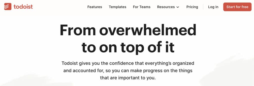
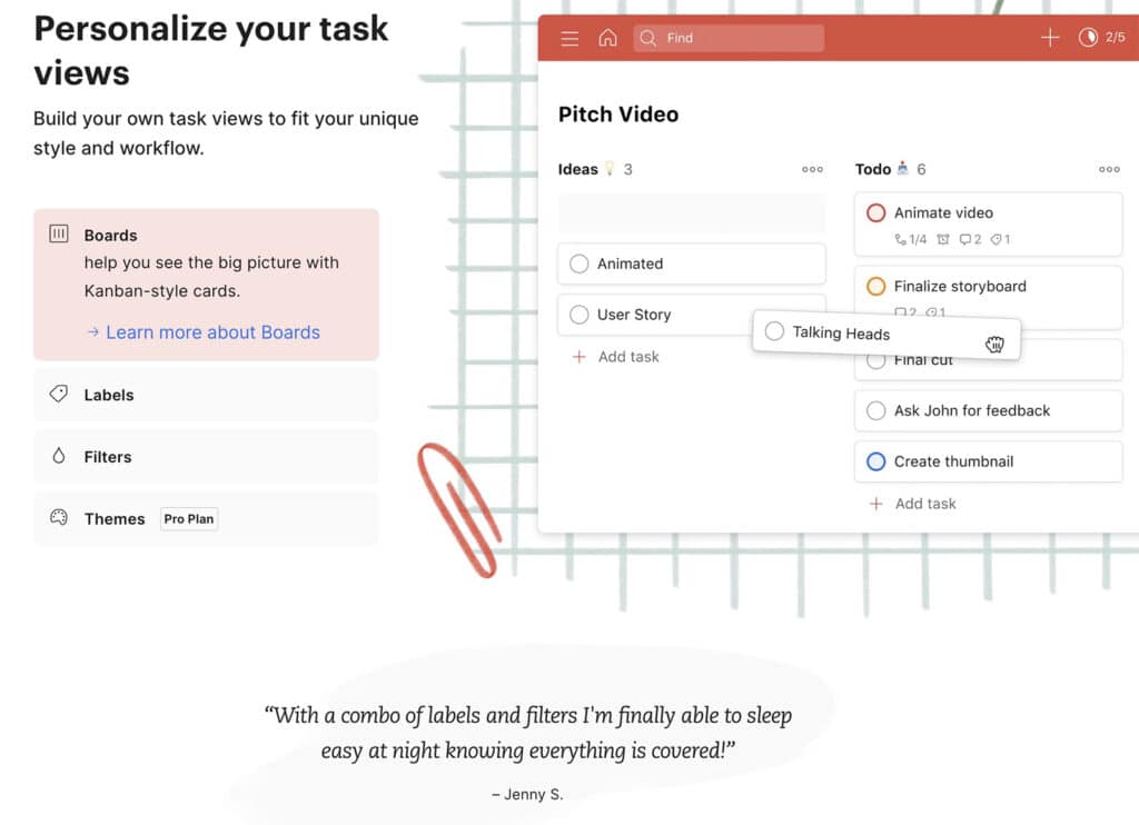
To-do list app Todoist leans heavily into benefits, describing exactly how buyers can expect to feel after using the tool. Along with a brief explainer video to showcase the product, the to-do list app also uses testimonials extensively, displaying customer quotes between each feature group.
Features-Focused SaaS Product Page Examples
Need to show visitors what your product does instead? Take a look at these features-first pages.
10. Scribe
Meg Zabrowski, Product Marketing at Scribe, recommends leading with features for a new category—at least at the start. Meg explains: “We’re building a new category, so a lot of people just want to know what our product is ASAP. As we continue educating folks on our category and competing more with other solutions, we anticipate moving towards leading with benefits more.”
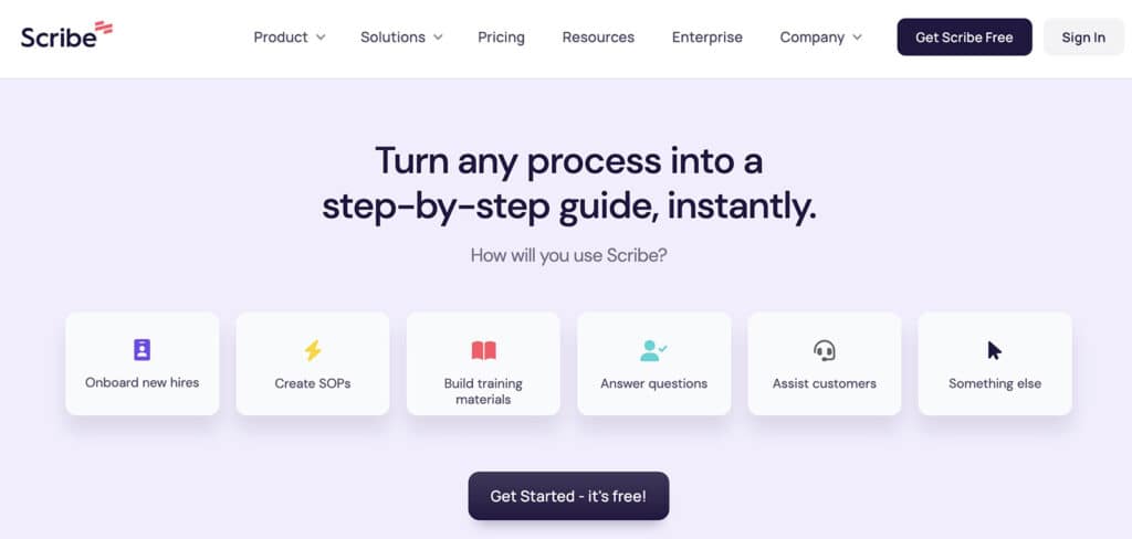
In some cases, an unusual onboarding experience may also boost conversions. Meg explains that the visual step-by-step guide software split-tested “a traditional hero (H1 + H2 + product image) and a more interactive experience. People were asked how they planned to use our tool and had the option to select between our 6 top use cases.”
“Clicking a use case automatically sent them through onboarding. We were surprised that the use case chooser worked so well because people had less of an idea about how our product worked (than they would have if they went through the website) yet activated at a higher level.”
11. Rows
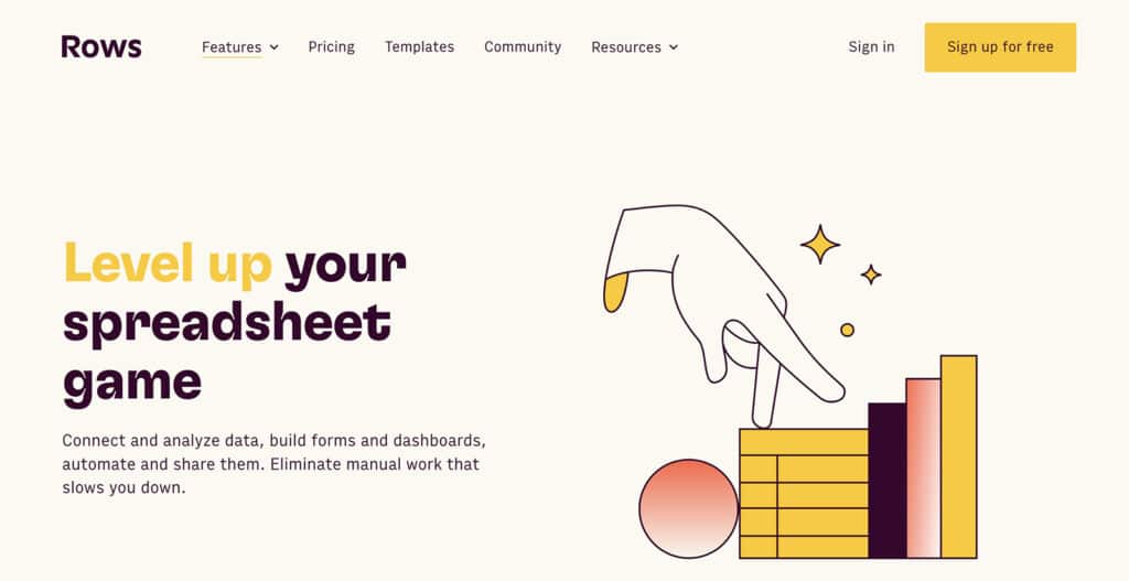
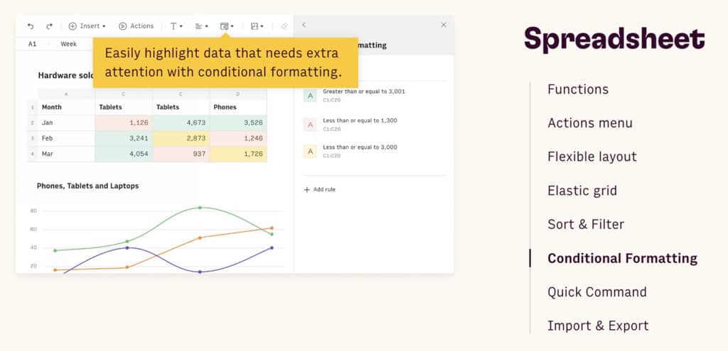
Another features-first product, Rows has a dedicated features page that explores what the spreadsheet editor can do. By scrolling through the dozens of screenshots, buyers can quickly see everything the tool offers so they can make a decision efficiently.
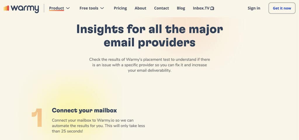
12. Warmy
Warmy takes the focus on features a step further by walking buyers through how to use the email deliverability tool. The product page highlights a three-step process to show how simple the tool is to set up and use.
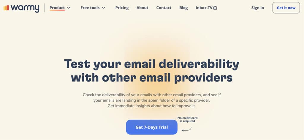
Vladyslav Vyshnevskyi, Growth Manager at Warmy, explains: “This approach was adopted to simplify the customer’s understanding of the product’s value proposition. Instead of bombarding them with a list of features or benefits, we broke down the process into three clear and actionable steps. This approach made it easier for them to comprehend the value of the product and how it could solve their problems.”
SaaS Product Page Examples With Standout Social Proof
Prefer to let customers or the press do the talking for you? Use these social proof examples as a model.
13. Letterdrop
Is social proof really that effective for B2B SaaS products? Absolutely. Parthi Loganathan, CEO of Letterdrop, explains: “Include social proof—nobody believes you so share a screenshot of someone else saying good things about you.” But make sure it’s clear enough to convey your message. He adds: “Be specific—user numbers and details. Do not talk about hand-wavy ROI or saving money/time.”
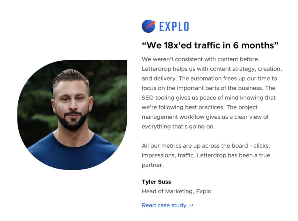
Each of the content distribution platform’s product pages prominently displays social proof, but the LinkedIn automation product page goes way beyond testimonials and client tallies. It also shows side-by-side examples of LinkedIn posts published with and without Letterdrop.
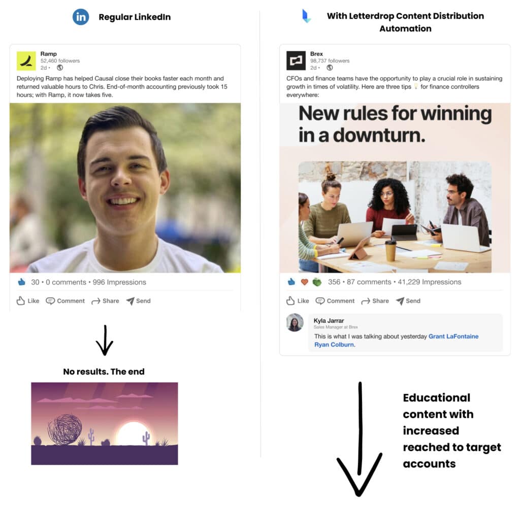
On the left, the post has zero engagement. On the right, the post has tons of engagement, which leads to inbound outreach—and eventually shorter sales cycles. Parthi explains: “We actually modified the graphic on the page based on who we’re selling to. Ramp is one of our customers and the current graphic uses them vs their competition Brex.”
So how can you make a good SaaS product page great? Parthi suggests: “Have an opinion—have a stance, possibly a villain or something you stand against. There is a right and wrong way to do things, and what you’re selling is the right way.”
14. Klaviyo
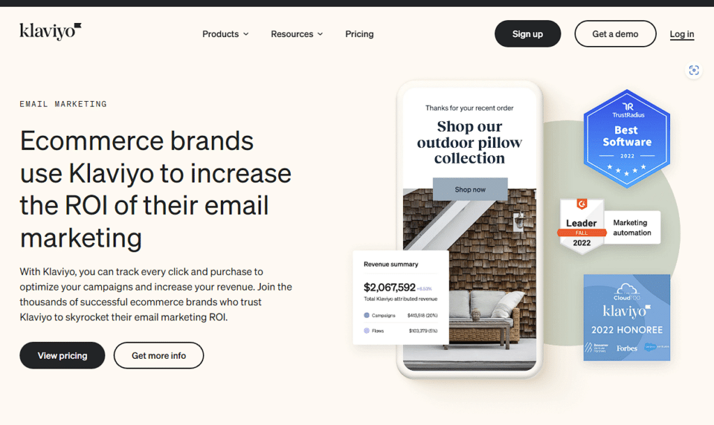
Klaviyo strategically places social proof throughout the platform’s SMS marketing product page. In addition to displaying the total number of customers, the page lists several impressive customer wins, each of which links out to a detailed story. The page also shares customer testimonials for added impact.
15. Loom
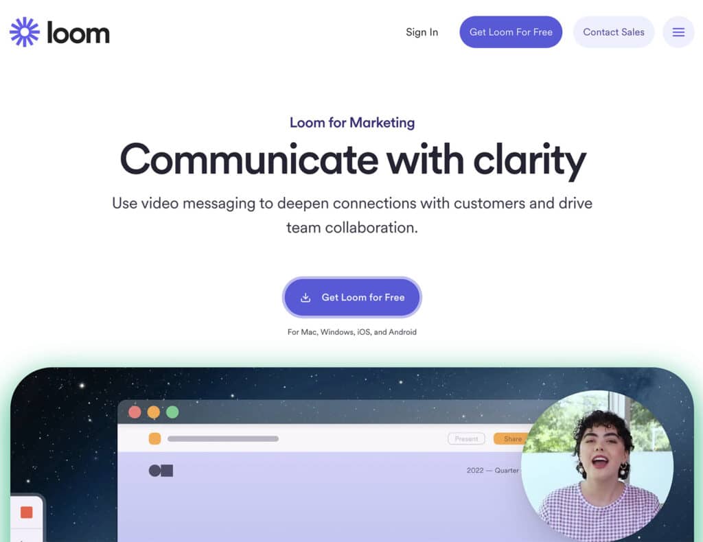
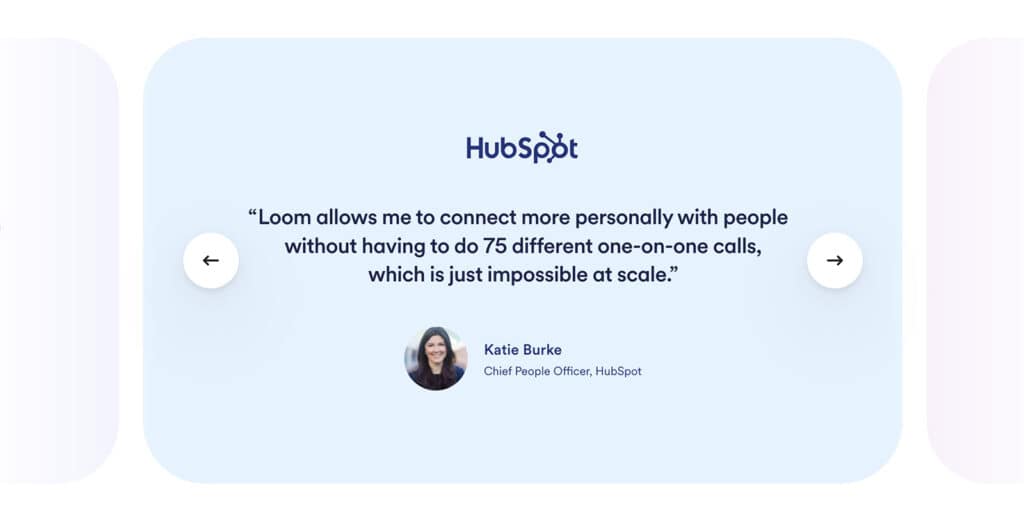
Loom leverages its own mix of social proof, including its total user base, a trust banner showing current customers, and a carousel of testimonials from B2B buyers. The video messaging tool has separate pages for various use cases, each of which shows social proof in the way that’s most likely to resonate with the buyer.
SaaS Product Page Examples With Outstanding Demos
Need to improve your demo conversion rate? Watch how these pages create a great demo experience.
16. PartnerStack
PartnerStack makes the demo for its partner ecosystem platform easily accessible from both the platform menu and the product page. Buyers can request a demo in seconds—but naturally, not every site visitor does. When the page first launched, that posed a problem.
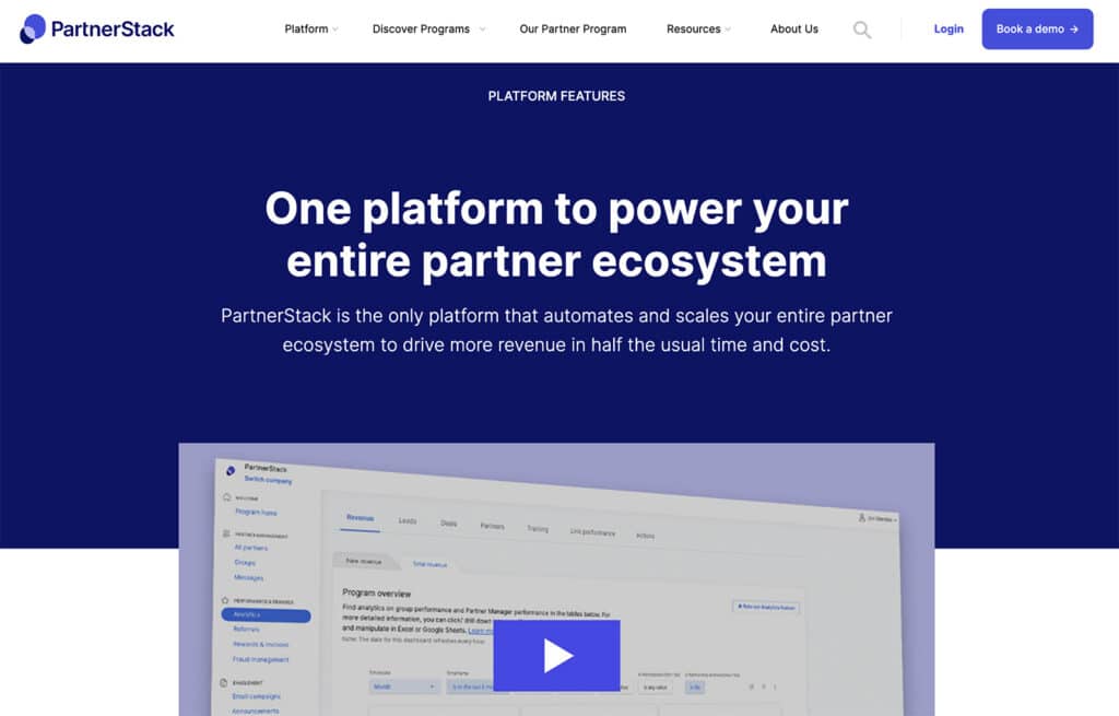
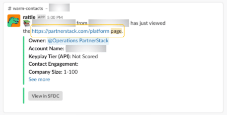
Joe Kevens, Director of Demand Generation at PartnerStack and the Founder of B2B SaaS Reviews, explains that the biggest mistake was “not creating internal buyer intent alerts on SaaS product page views. When PartnerStack added a product page, we made the mistake of focusing solely on the on-page conversion rate (to demo), which was only 1-2% of the page visitors.”

“To engage with the other 98-99% who don’t reach out to us, we set up internal alerts of who’s on the page so our sales team can reach out to them (see example below). Our sales team books more meetings by having this buyer intent intel, which helps us get more value from our SaaS product page.”
17. Ocoya
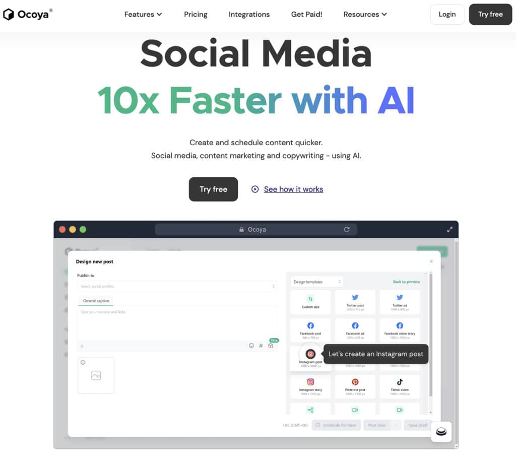
What’s the optimal placement for a demo? Ocoya places the social media scheduler’s interactive demo front and center, directly below the tagline on the main product page. B2B buyers can click through the entire platform in seconds, instantly understanding the workflow and experiencing the features firsthand.
18. SwipeWell
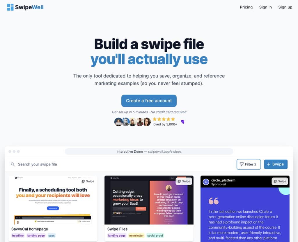
SwipeWell also encourages buyers to demo the swipe file platform directly on the product page. Users can scroll through a sample swipe file and engage with the saved items, testing out the product in real-time.
Final Thoughts on SaaS Product Pages
To maximize conversion rates and improve customer acquisition, you need a product page with the right positioning, CTA, social proof, and UX. Use the examples above as a guide to optimize your page and add more qualified leads to your flywheel.
