How to Build a SaaS Site That Stands Out & Converts

The SaaS industry has been booming for over a decade, and that isn’t changing any time soon. Cloud-based software can help businesses and individuals alike do everything from automating their workflows to run better ad campaigns to booking video calls and appointments online.
While brands are turning to SaaS tools to help them with so many different elements of their businesses, however, the reality is that the competition is fierce. As a result, it’s essential to create a SaaS marketing plan that helps you stand out… and that means building a strong SaaS site.
While so many brands have great tools, only a handful actually have solid sites that can help them stand out. In this post, we’re going to take a close look at how to build a SaaS site that will actually showcase your product well, help you stand out from the competition, and convince users that you’re the tool they need.
What Your SaaS Site Needs to Accomplish
When you’re building your SaaS site, remember that it must accomplish the following:
- Looks professional, clean, and on-trend to signal that you’ve invested a great deal into your software (no one wants to adopt a tool just to have it disappear a few months later)
- Explains what your tool offers, how it can be used, and what it’s value proposition is
- Showcases images of the tool’s interface and the tool in use if possible
- Includes easy access to trial, demo, or “contact sales” prompts near the pricing so that it’s easy for users to convert
These are the principles that will impact the foundation of the site that you build. With these in mind, let’s take a look at how to build the rest of your SaaS website.
The Technical Part of Building a SaaS Site
The very first thing that you should consider when building your website is the technical side.
There are three core aspects you’ll want to consider.
Tech & Functionality
Some brands make the mistake of trying to get too flashy with the tech on their sites, thinking it will make them look more impressive with cutting-edge site features. This isn’t necessary, and in some cases, brands go too big with tech and it causes problems with usability. That’s the last thing you want.
Instead, keep it simple with the core focus being on the content and brand itself. This helps your site be “future proof” as technology changes over time, and it makes your site much easier to keep updated.
Make sure that you’re testing your site on mobile devices to ensure that it’s running quickly, it works on multiple browsers, and that none of your additional media (especially videos!) are slowing down site loading speeds.
Site loading speeds are important; you need to have your mobile site loaded within 3 seconds or you’ll risk losing over half of your visitors. Page loading speeds are also an important factor when it comes to Google’s own algorithms for the SERPs. You can check your loading speeds with Google’s free PageSpeed Insights.

Consider WordPress
I feel like everyone hates WordPress. In half of the writing and entrepreneur groups I’m in online, I swear I see a “What can I use instead of WordPress” post at least once per week.
We’re still going to go ahead and recommend using WordPress anyways when you’re figuring out how to build a SaaS site. It may have a bit more of a learning curve, but the customization potential is exceptional.

WordPress is an enormous ecosystem made up of plugins, themes, and highly technical and experienced contractors who know it well. The sky is the limit here, whether you want to stick to existing themes with simple layouts or you want to go full custom. (I worked with developers on my own site, for example, to complete a custom theme for exactly what I wanted.)
You can easily expand your site’s capabilities to offer free tools designed to reel users in (check out Breadcrumbs’ free email verifier as a great example!) in addition to your core product.

Don’t Forget Accessibility
Plenty of brands treat accessibility like an afterthought, but this is the last thing that you want to do.
If your site isn’t fully accessible, you run the risk of alienating potential users and potentially being hit with an accessibility-related lawsuit. (The specifics will depend on where your business is based, but many countries require that websites are accessible to all users. In the US, this falls under the ADA.)
There’s the basics: Have alt text set up on your site, include captions or transcripts for all video and audio files, and make sure that the search bar is voice-search friendly.
To protect your own brand against lawsuits and ensure full accessibility, your best bet is to stick to the most recent version of the WCAG.
Host on a Separate Server for High Security
There are plenty of services where you can create and host your site in one place, but it’s best to keep the site hosting on a separate server for increased security. To make this a more streamlined process, check out services like Kinsta, which offers managed WordPress hosting and comes with enterprise-grade tools to help with lightning-fast CPUs, performance monitoring, and a global content delivery network.
The Design Components
Now that we’ve looked at some of the core technical components every SaaS site needs to have, let’s talk design. There are a few key design components that every website for SaaS companies needs to ensure they’ve got covered.
Usability First, Design Second
Usability should always come first when we’re talking about a SaaS site design (or any site design, for that matter). It doesn’t matter if the site looks flashy and incredible and “cutting edge” if people can’t use the site.
Think about:
- Intuitive navigation with an easily-visible navigation bar and well-organized drop-down menus
- Featuring only a few key, short videos on relevant pages to explain product use cases without slowing down site loading speed
- Having well-placed CTA buttons that take users directly to high-value pages so they can sign up for trials, demos, and get in touch with customer support
To put it simply: Usability & speed > impressive design.
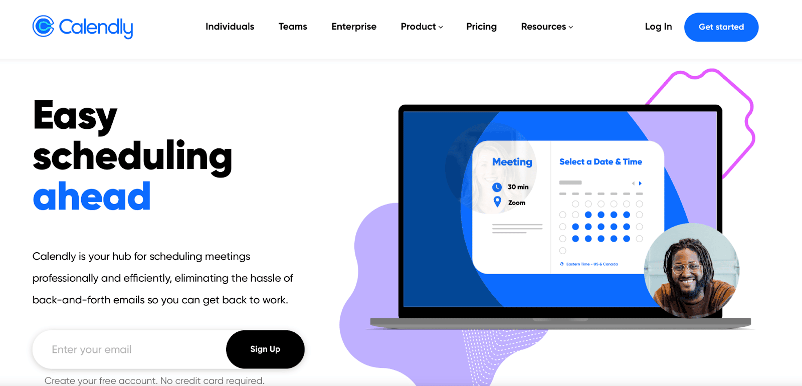
Calendly’s site is a great example of a well-executed, straightforward design for a SaaS homepage that looks professional and gets the job done well. Their site is organized to help users find the information that’s relevant to them right away (broken down by audience niche with options like “individuals” and “enterprise”), and they use a gif to quickly showcase the product.
Make It Unique to Create a Strong Brand
Many SaaS brand websites are built in a hurry. People have a great idea, a solid beta program ready to launch, and an itch to get everything out there into the world.
Trust me, we get it. I’ve worked with a handful of SaaS brands who think “fast first, quality later” when it comes to the actual site design, but this can end up hurting the brand’s launch and long-term success alike.
Most sites has an image of the product, a CTA or trial sign-up, and one or two primary colors that compliment a logo (which is almost always a simple graphic design).
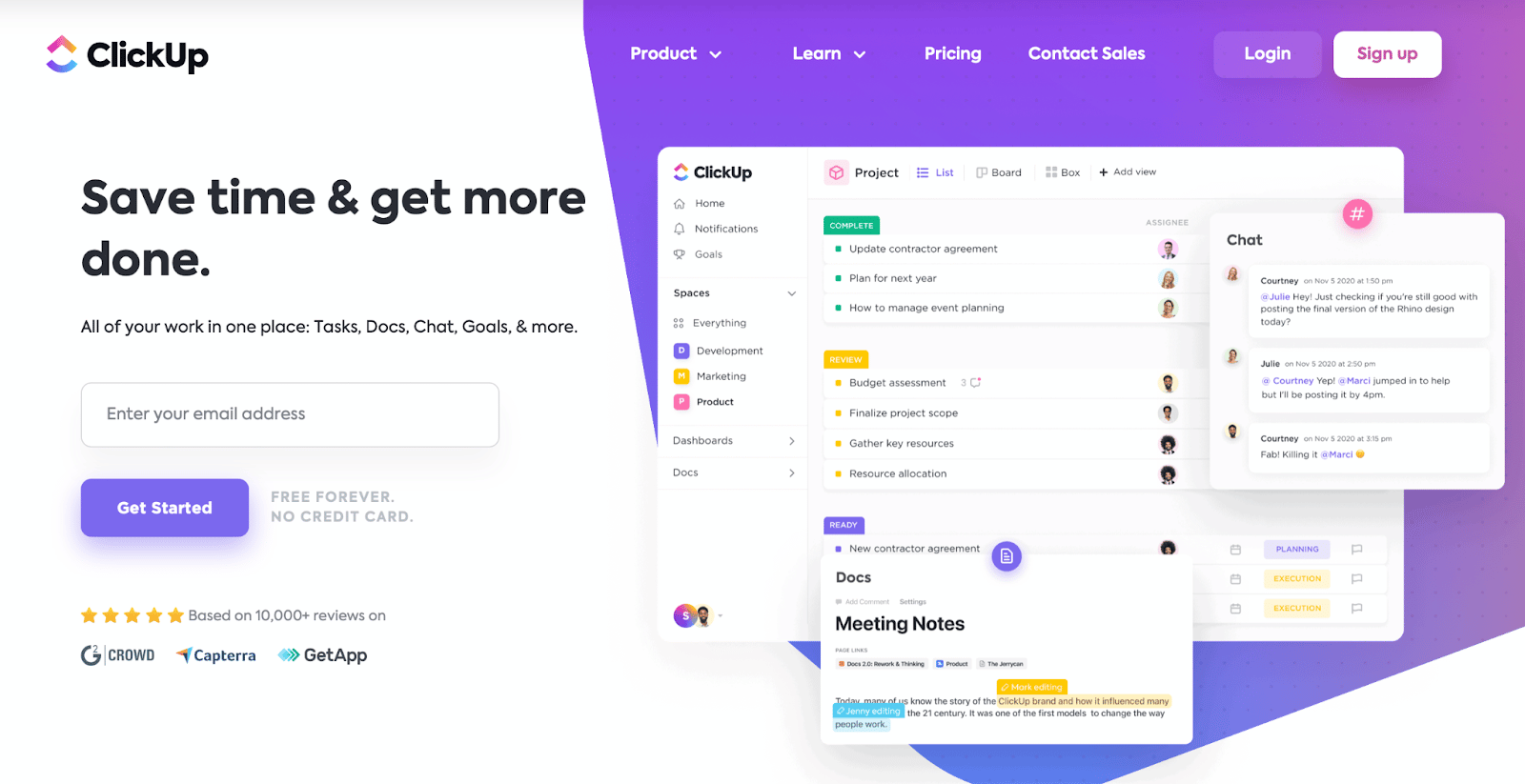
It works. It’s fine. But we want you to create a SaaS site that’s more than just fine and effective. You want to shoot for exceptional.
Start by creating a strong, unique site that establishes a strong brand right from the get-go. DivByZero’s Massimo Chieruzzi spoke about this in an Evergreen Profits podcast episode, explaining how it helped to establish brand recognition for AdEspresso and then (years later) his new venture at Breadcrumbs.
AdEspresso created their now-famous icon, a waiter with espresso, which ended up making an appearance across the site, in featured images on blog posts, and on lead magnets. It helped create a recognizable brand.

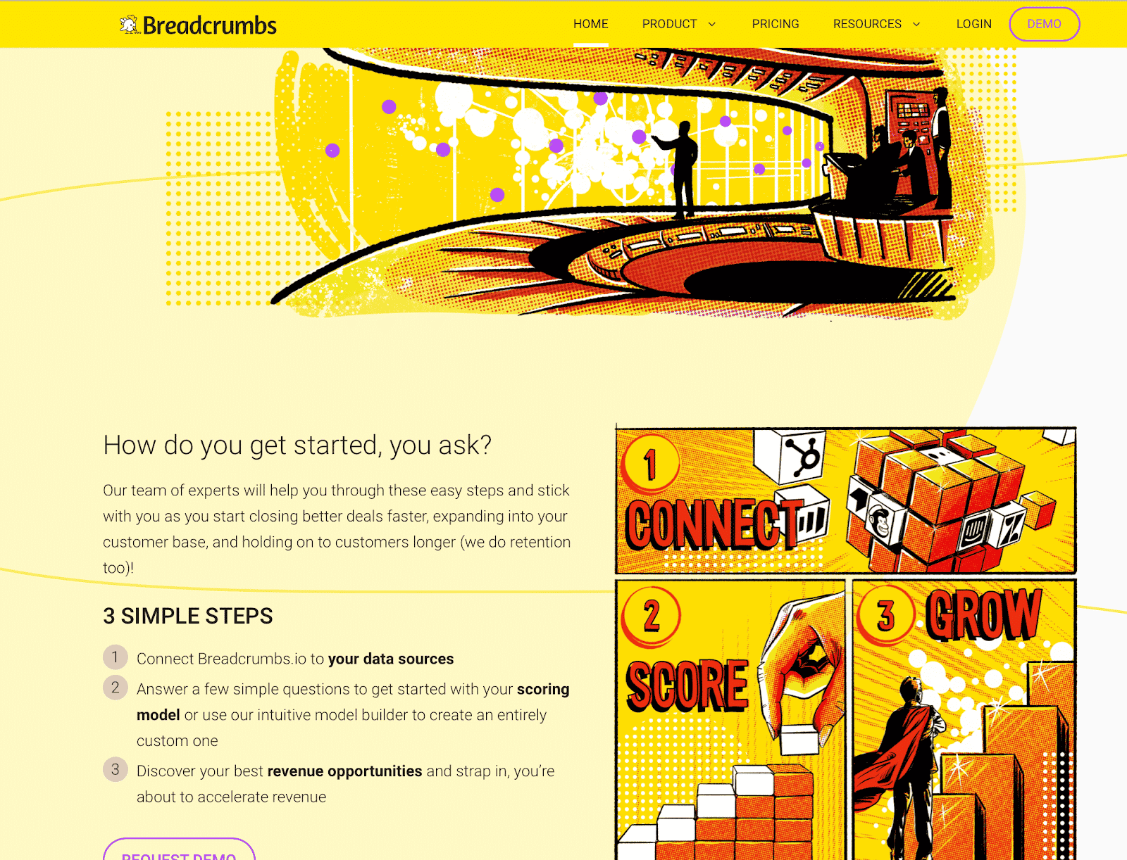
Breadcrumbs.io has a bold, unique, superhero-from-the-comics-esque look that immediately sets it apart from every other SaaS site on the market. It’s bold, bright, and is immediately memorable.
Must-Have Sections of a SaaS Site
You’ve taken technical and design components into consideration. Now you need to create the individual pages.
While every site and every SaaS brand is unique, there are a few must-have pages that every single one absolutely needs to include.
Homepage That Communicates Benefits (Not Features)
It goes without saying that your site needs to have a homepage— but how are you optimizing it to increase conversions?
One of the best tips that Massimo had to offer about creating a SaaS site homepage was to focus on detailing the benefits that your product can offer and not the features. The features are important (they explain how you can offer those benefits), but the first thing that users need to understand is why they should use your tool.
Deputy does a great job of this on their home page. Check out the two images (one is above the fold, and one is below).
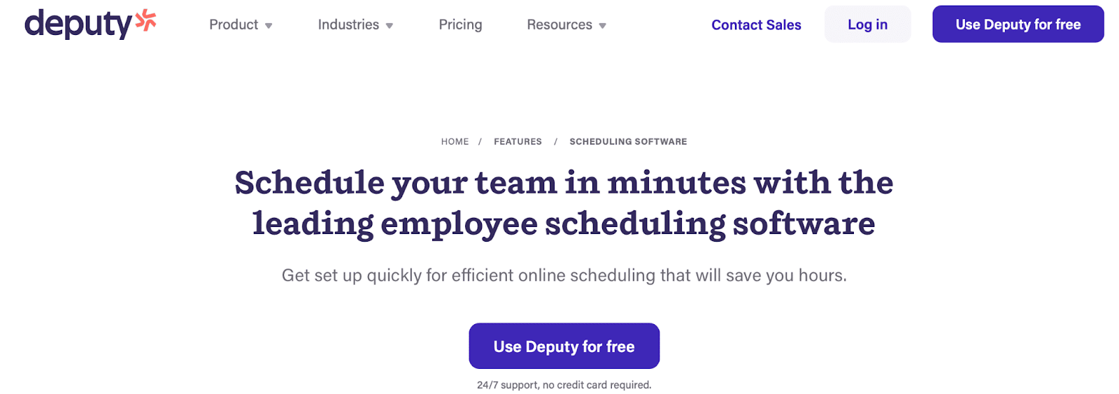
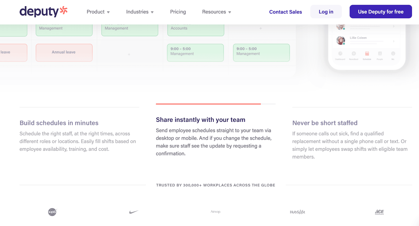
They focus on the benefits to the user— fast scheduling, fast sharing, and the ability to find replacement employees so you’re never short-staffed. They’re not diving deep into their features or the tech, because they don’t need to; they just need to hit those pain points, and they did.
About Us
The About Us page isn’t nearly as crucial for SaaS brands as it is for traditional service-based or even eCommerce brands.
It’s partially for ego, though it can make an impact on investors and potential hires who are learning about the people behind the brand.
Customers, however, rarely look at the About Us page for SaaS tools.
As a result, it makes much more sense to optimize this page to appeal to investors, potential partners, and potential hires since they’re the ones who are going to be doing their due diligence here.
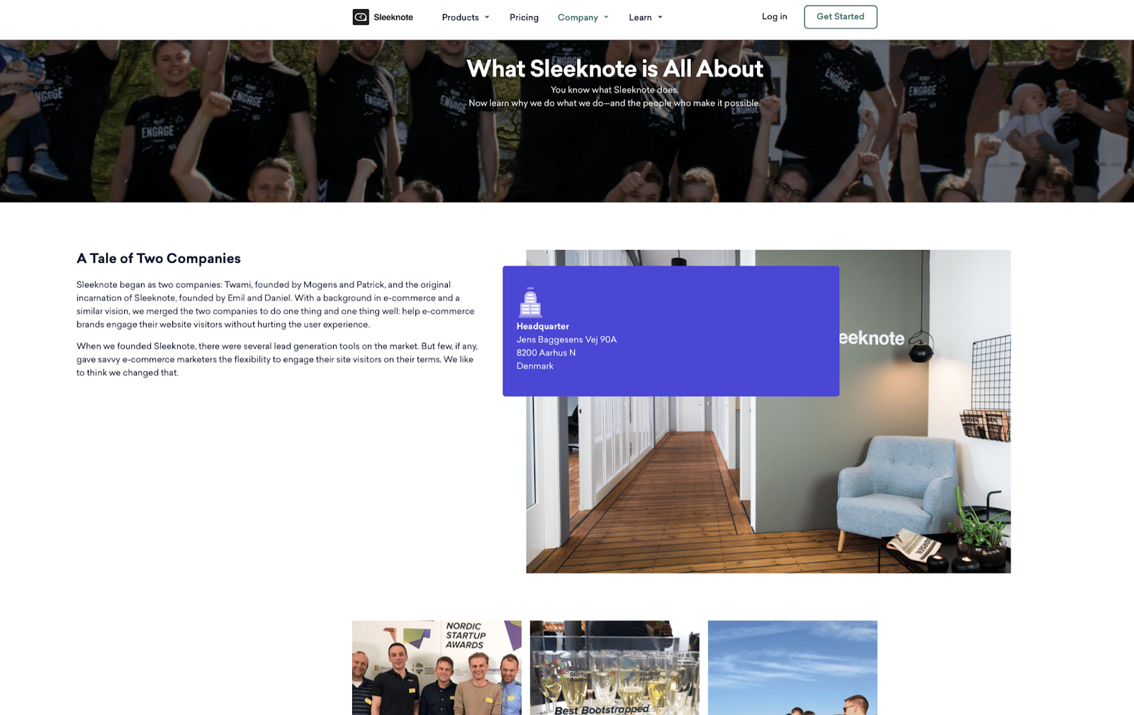
Sleeknote has a great example of a SaaS site About Us page. They’ve got a picture of their team front and center (babies included to show that they’re family-first), pictures of their team at different events, and the story of how two companies merged.
A Pricing Page
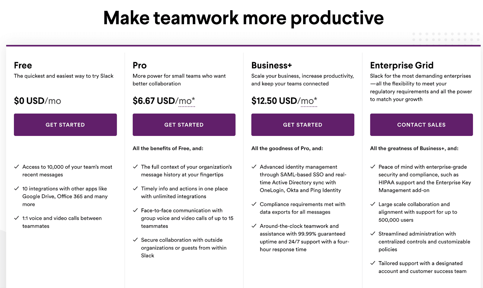
SaaS tools should always have pricing pages available. Many brands (especially in small- and medium-size companies) are on a tight budget, and they’re less likely to even consider you as an option if you don’t have clearly-displayed pricing somewhere on your site.
Try optimizing your pricing page by doing the following:
- Featuring a “preferred” or “most popular” tag on the plan that you want users to focus on; you can use this for upselling purposes to encourage users to higher-level plans
- Having a clear breakdown of what’s included at each pricing tier, including how many users can access the account and what features they can access
- If custom plans and pricing are available, mention that
- Automatically show users the annual per-month cost (which has a discount) to increase the odds of an annual purchase
Slack’s pricing page is a solid example:
Looking for more inspiration? Check out some SaaS pricing pages examples here.
Product Tours
You want to have a variety of different “product tour” options available, which showcase how to use your SaaS tool. This is important; it gives them a close-up look at how the tool works, the interface, and the features.
There are several different options: 1:1 calls, on-site videos, screenshots, and demos. All sites should at least have screenshots that show the actual product interface in use, but having videos, calls, and demo options available can help you nurture clients who interested but not ready to convert.
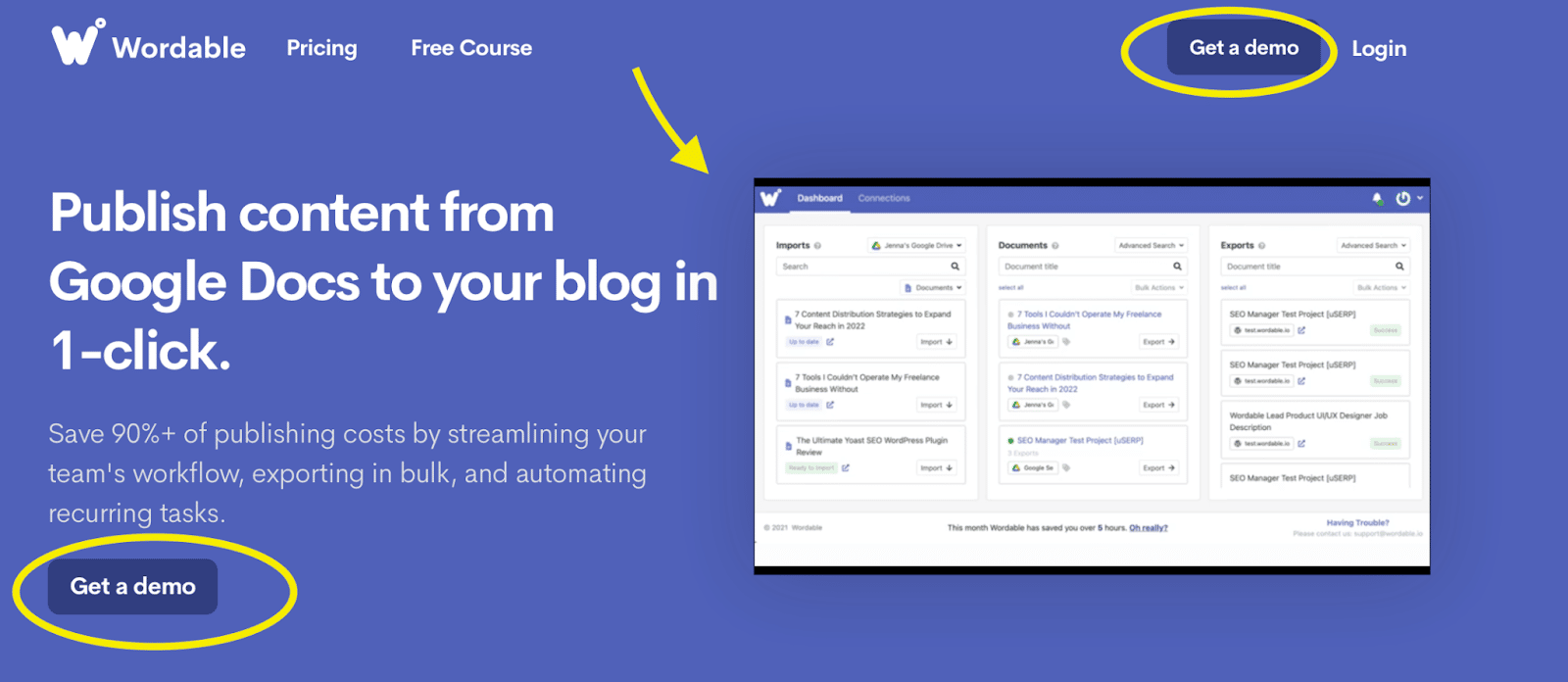
Wordable.io uses a video on their homepage and has multiple “Get Demo” CTAs available for more in-depth product tours.
Remember, too, that as you’re showcasing product features that you’re tying in those benefits, explaining how they can help the user.
Pages by Use Case
Remember how we mentioned above that Calendly had pages dedicated to different use-cases? They’ve got a page for “Individuals,” one for “Teams,” and one for “Enterprise.”

Some tools may be small and niche enough that you don’t need this, but many will have different audience segments that they’re targeting.
And a freelancer who is using a scheduling tool to book meetings is going to look for different features than a team who uses Calendly to accept demo bookings that are auto-assigned to convert new clients.
Including these pages shows users that your tool is a good fit for their needs right off the bat, and makes it easy for you to show them why.
Changelog Roadmaps
Most SaaS companies actually do not have changelog roadmaps on their site, but we’re a huge fan of including them.
Roadmaps are incredibly effective at showing potential customers that the product is being consistently updated, that your team cares about delivering the latest and greatest features, and it highlights where you’re planning to go next.
Imagine choosing between two tools with nearly-identical features, but one has a changelog that shows that they’ll be releasing something unique soon. You’d likely choose them.
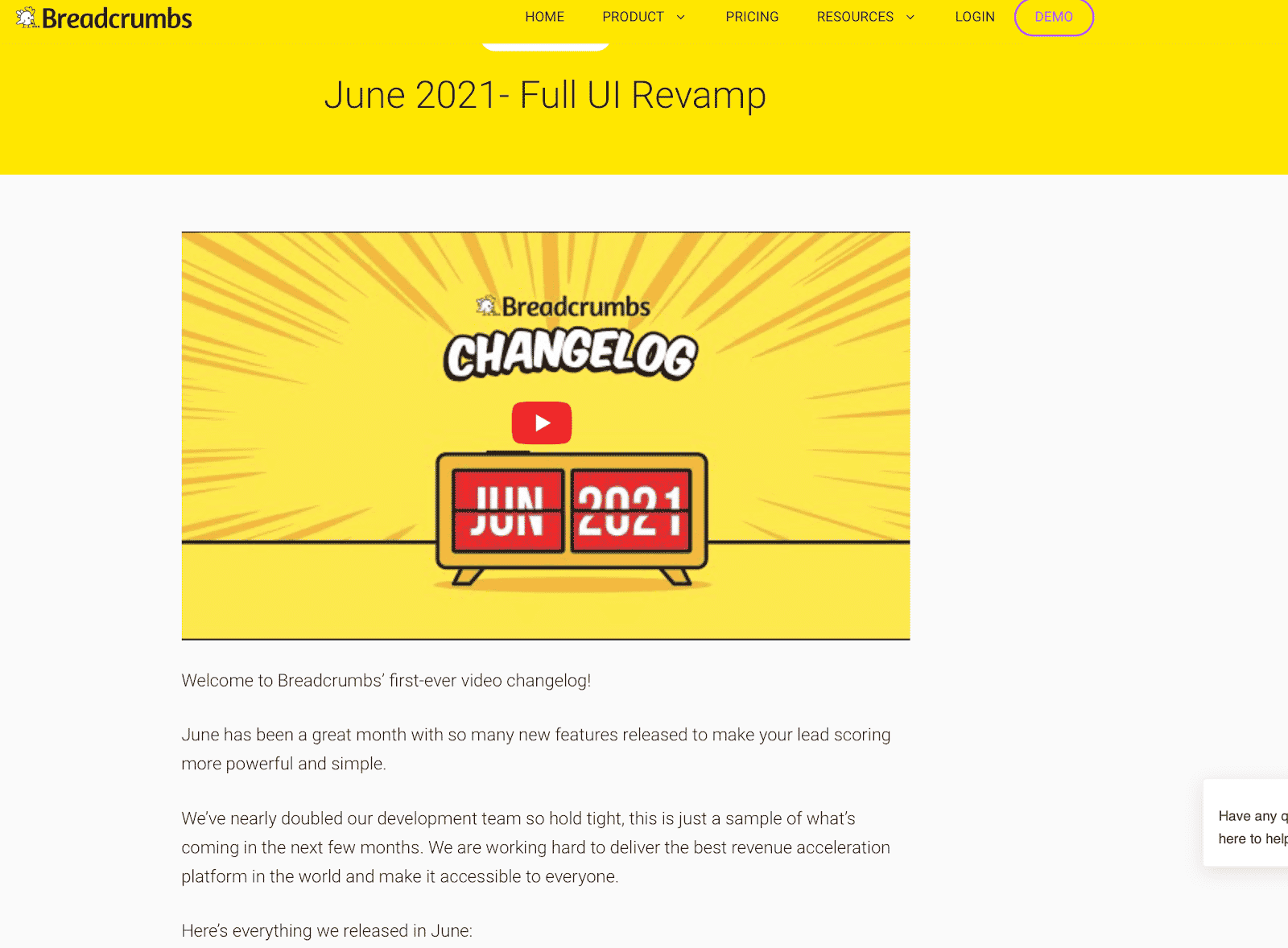
Over at Breadcrumbs, we have Changelog section of the site, which includes individual video and text updates to keep users updated.
Final Thoughts
There are so many great SaaS examples of how to create unique, useful, and wildly popular tools. And while there are many different paths to generating success, it can be almost impossible— and certainly much harder than necessary— if you’re going about it without a strong, well-optimized site.
The above are the tips and must-have features of a SaaS site that we’ve seen become essential over the years to help you attract customers, convince them to convert, and stand out. When you’re ready to determine how to build a strong SaaS site, these tips are where we recommend starting.
Interested in learning more about SaaS marketing? Check out our blog for more resources!
PS: If you’re not building a SaaS website from scratch but redesigning an existing one, don’t miss Massimo’s guide on website migrations to make sure you don’t hurt your SEO.
