10 Best SaaS Pricing Page Examples in 2023

As a seasoned SaaS marketer and founder, I devote substantial time and energy to examining SaaS pricing pages.
I’m acutely aware of the strategic orchestration and thoughtful planning that goes into formulating SaaS pricing structures. The presentation of these structures deserves just as much, if not more, attention.
Selling digital solutions necessitates maintaining an impeccable online presence. It’s crucial that when your Marketing Qualified Leads (MQLs) find themselves on your SaaS pricing pages, ready to make a purchase, they continue to receive an excellent user experience.
A significant element of SaaS marketing revolves around expressing your product’s position and its inherent value through well-structured and strategic messaging.
However, differentiating between various SaaS pricing packages can pose a challenge.
It’s often difficult to articulate the distinctions between plans to users who haven’t had an in-depth experience with your product yet.
Your SaaS pricing page is a crucial platform for demonstrating value, fostering trust, and guiding prospective customers on their path to becoming engaged users of your product.
Arguably, it is the most important page on your website after the Home Page, and can truly make or break a deal.
That said, a masterstroke in nailing the pricing page can really help your SaaS co. set itself apart from the competition.
Below are examples of 10 SaaS pricing pages that are absolutely incredible.
There’s something to learn from each one of them, so let’s get started.
But first, let us identify the character
What makes a pricing page stand out?
If your pricing page is not meticulously crafted and intuitive, you may lose prospects before they even select the ‘Buy Now’ button. The best pricing pages, you’ll see, boast neat layouts, use straightforward language that connects with the customer, and strive to build confidence between the business and the consumer.
Let’s delve into the essential elements of an optimally functioning pricing page.
Crystal Clear Pricing
Top-tier pricing pages showcase transparent packages, designed to suit businesses of varying sizes and budgets. If your primary clientele consists of enterprise companies, it’s essential to use language that specifies that you cater exclusively to this segment.
Rather than stating prices, you could opt to feature a ‘Speak to sales’ button, allowing enterprise purchasers to request a customized quote.
It’s worthwhile to include both monthly and annual subscription options, especially if you’re in the SaaS market. For capturing overseas clients, enable users to view prices in their local currency.
These subtle modifications can significantly eliminate any hindrances to conversion. Always remember to perform A/B testing on your pricing to determine what best appeals to your customers.
Simple Language
While the pricing page might seem like a suitable spot to use specialized terms, particularly if your target audience consists of professionals highly skilled in their field, it’s advisable to keep the details of at least one package simple and free of industry jargon.
This ensures that even those lacking field-specific expertise can discern which package aligns best with their team’s needs.
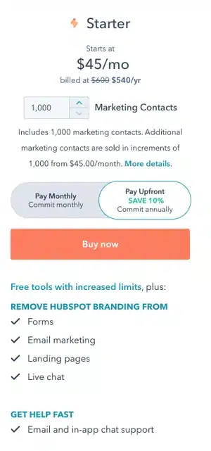
You can adjust this strategy depending on the specific package. For example, on HubSpot’s pricing page, the language used to describe the starter package for Marketing Hub is extremely basic. Phrases such as “Forms”, “email marketing“, and “live chat” are self-explanatory. Even individuals with minimal marketing knowledge will promptly grasp the advantages of a starter subscription.
User-Friendly Layout
The most effective pricing pages offer users an effortless navigational experience. This doesn’t imply that your pricing page should mimic the design of a landing page, which is generally simplified to promote form submissions.
You’re free to include ample details on your pricing page; however, elements such as fonts, colors, links, and buttons should be structured in a way that is straightforward to follow visually.
Here are some hacks which will help you get those extra conversions
Confront apprehensions, uncertainties, and reservations
When expounding the advantages and worth of your product or service, ensure your FAQ section tackles all prospective hesitations your clients might harbor. Incorporate assurances like money-back guarantees, hassle-free returns, and minimized risk. Often, customers don’t make immediate purchases. They typically interact with your offering multiple times before deciding unless they’re already well-informed and prepared to buy. The apprehension of financial loss is palpable. Persuasive language and demonstrations of potential benefits can greatly alleviate this fear.
Implement urgency and fear of missing out (FOMO)
Despite the common gripe about FOMO, it remains an influential marketing tactic and can be triggered by urgent messaging. Effective ways to do this include quantifiable data showing the number of people enjoying your products and services. Other strategies could be rewards for prompt decisions, exclusivity and time-limited offers, color cues, and scarcity-based language.
Cultivate trust
High-converting pricing pages establish an unshakeable trust with their users. Integrity in presenting information to your customer is vital. Displaying security seals, money-back guarantees, and social proof like customer testimonials contribute significantly to trust-building.
Employ buyer personas in devising tables and tiers
Your buyer personas should correspond with your plans. Every brand should develop several buyer personas to better comprehend its customer base. This can assist in designing pricing packages that cater directly to your audience. If you don’t invest time in understanding your customers’ needs and identities, you risk neglecting crucial elements or failing to solve their problems.
Bypass decision overload
Ensure you offer a variety of appealing options, but not so many that your customers struggle to identify the best one for them. Prevent users from being swamped by text and options. Headlines should be informative enough to guide users through your page. Encourage them to perform minor actions, such as clicking a button to indicate interest. This is where offering a free trial can be particularly effective.
Advocate for annual payment plans
When users commit to an annual plan, you’re on the right track. The key to achieving this is to make it appealing. Consider providing substantial discounts on annual plans to incentivize your visitors. Highlight this option to emphasize its potential for cost savings.
Convert prices to local currencies
Ensure your customers can view product prices in their local currencies. This can be automated with certain apps, or manually adjusted for different website versions. This step simplifies the purchasing process for your customer and conveys your consideration for their needs and location.
Offer live chat support
Live chat support can greatly influence a sale. It provides an opportunity to address any potential objections from your customers and reassures them about their purchasing decisions. Live chat not only enhances engagement and lead generation, but it also promotes customer loyalty and decreases cart abandonment.
Introduce exit-intent popups
Consider incorporating exit-intent popups on your pricing pages. These are intended to present an irresistible offer just as a customer is about to leave, potentially recouping abandoned carts and increasing sales. Though some customers may find this irritating, others may be swayed by the last-minute offer to finalize their purchase. This underutilized tool can prove quite potent.
Elements of a Pricing Page
The design of your pricing page ought to be customized to match your brand and the cost of your offerings.
Much like when you create a website, it’s crucial to ensure that your brand’s identity remains consistent and your communication maintains its unique voice and suitable tone across all pages.
Even though pricing pages serve a predominantly transactional purpose, they should still integrate harmoniously with the rest of your website’s content.
Following are the different components of a pricing page
Layout
Crafting a user-centric layout for your pricing page is key. This involves facilitating effortless navigation and providing a seamless browsing experience.
Although a pricing page shares similarities with a landing page, it serves to directly offer critical information to your target audience, displaying price options or subscription plans in a clear and uncluttered manner.
All pivotal elements, including at least one call-to-action, should be visible above the fold.
Appreciating the psychological factors that influence the design of a pricing page can aid in enhancing your conversion rate. Ensure visitors comprehend the page’s context and content, as they are genuinely interested in your offerings. If your product or service appears pricey, it’s beneficial to provide comparative options.
Information
Before outlining your message, prioritize presenting your information in a logical sequence.
Pages lacking in comprehensive information may leave potential buyers feeling overwhelmed, distracted, or disheartened.
If you offer similar packages, emphasize their unique attributes. Highlighting the most premium plans upfront with a recommended option is a proven strategy.
Language
Communicate with potential customers in your unique brand voice. Depending on your target audience, the language should be comprehensible.
Even if you employ industry-specific jargon in your pricing table, at least one tier should employ straightforward language. Emphasize terms like “live chat” and “free trial” to bolster trust.
The choice of copy and colors is paramount. The aim is to showcase the benefits and value you deliver. Your copy should emphasize the advantages of your features without sounding overly promotional.
Your terminology should encapsulate value and differentiate your offerings. Use brand-oriented naming for your packages based on customer segments.
Give special attention to your CTA. Steer clear of generic terms like “submit,” “download,” or “buy now,” which tend not to perform well.
Be explicit about the action you desire users to take or the benefit they stand to gain.
When designing your chart or button, use a contrasting color for maximum impact.
Pricing
Present your pricing options and packages transparently. If you have various packages catering to diverse customer profiles and budgets, each option should resonate directly with that demographic.
An effective pricing page facilitates informed purchase decisions and optimizes conversions. By spotlighting a recommended plan, you can minimize confusion and guide customers towards the best value.
CTA and Testing
Your CTA is crucial and should be distinctive with a clear directive for your customer.
Differentiate it based on features and price. Start the CTA with an action word and elucidate what the customer will gain upon responding.
Regularly test your CTAs and other elements of your pricing page to evaluate their effectiveness. This data-driven approach outperforms arbitrary changes.
Experiment with different layouts, pricing, copy, headlines, colors, and any other user-interactive elements.
Set to delve into some of the most impressive pricing pages available online? I’ve carefully selected the cream of the crop for you.
Slack
Slack’s pricing page serves as a prime example of exemplary page design. The pricing alternatives are displayed within a clean, visually appealing table that’s easy to glance through, and their comparative feature presentation is a breeze to skim.
You’ll see that their Enterprise Grid subscription encourages users to ‘Contact Sales.’ This is a brilliant strategy to motivate high-value customers to engage with an account manager and devise a tailored solution.
Ultimately, even though the header copy is straightforward, it efficiently communicates Slack’s unique selling point. The application pledges to ‘boost team productivity’ in your company, leading to more productive teams and a subsequent surge in ROI.

Zendesk
Zendesk prompts users to participate in a quiz, enabling them to suggest the most suitable plan. This approach not only makes the users feel at ease but also enhances their intention to make a purchase.
As you scroll slightly on Zendesk’s pricing page, you’ll encounter a prompt to review the plan comparisons.
I admire their approach of displaying the exhaustive list of key features along with their value proposition-all without necessitating the user to navigate away from the page.
This degree of clarity supports your sales team in allocating the correct product to suitable customers, thereby enhancing customer satisfaction over time and minimizing churn rate.

Detectify
Detectify’s pricing page design is a little out of the ordinary, but it makes for a really cool user experience.
Users can buy a security subscription for websites they’re hosting, or for applications they’re building. This works really well for a single product with a price that only changes depending on the number of domains, sub-domains, and applications associated with the business.
Plus, we’re suckers for simple calls to action.
The button prompts the user to start a free trial, making it simple for visitors to understand what they need to do.

Squarespace
Squarespace utilizes compelling header text: “Beautiful websites Free for 14 days” Instantly, they reassure users that they are not obligated to pay to experience their service; users can immediately explore the platform by hitting the “Start Free Trial” button.
It’s also commendable that they incorporate a section for frequently asked questions directly on the same page as the pricing chart. This ensures that users can have numerous queries addressed without the need to scour for answers.

Semrush
Keyword research platform Semrush (refer to Semrush’s pricing page) employs a crisp black-on-white background design for its pricing page.
The bright green buttons and prominent pricing are instantly noticeable, eliminating the need for visitors to search or scan — this facilitates quicker decision-making.
Semrush incorporates a toggle feature, allowing users to swiftly compare the cost of annual versus monthly payments.
The designers also spotlight the savings in a contrasting color, sparing users the task of computing the discount themselves.
Semrush’s SaaS pricing page exemplifies the effective use of visual hierarchy, color, and spacing to render content quickly scannable, and easily digestible.

Asana
Asana’s pricing page grabs the attention of users with an offer of free signup and unrestricted access to all features, proclaiming “No credit card required,” followed by a “Get Started” call-to-action button.
This tactic is an effective way to encourage potential customers to try your product instantly, risk-free, a fact underscored by the copy.
Moreover, Asana employs a freemium model, permitting people to utilize Asana until they feel inclined to access premium features.
Freemium pricing strategies provide an exceptional opportunity for users to explore your product without any risk or obligation.
As the tool becomes integral to their daily operations, they are less likely to abandon it, thereby increasing the chances of transitioning to a paid plan as their requirements expand.
Accordingly, the design takes this business strategy into consideration.

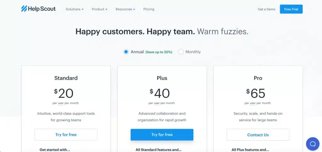
Helpscout
Help Scout’s pricing page accentuates the brand’s fundamental message of assistance, which is ideal for a customer service SaaS platform.
They offer a simple pricing model with a three-tier pricing table that emphasizes the company’s optimal plan with a bright blue button, skillfully employing color to its maximum benefit.
Help Scout incorporates two radio buttons allowing users to toggle between annual and monthly pricing, and underscores the 20% savings for an annual subscription (Discover more about persuasive design patterns.)
The rule of thirds is also observed in Help Scout’s pricing page table design. They present three distinct plans and only mention their special offerings for nonprofits beneath the table.
As a Certified B Corporation, Help Scout commits to planting a tree for every new customer. This eco-conscious initiative enables customers to feel positive about their purchasing decision, reinforcing Help Scout’s ethos of providing assistance to people.
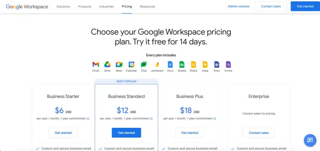
Google Workspace
Google Workspace’s pricing page prominently features the platform’s 14-day trial in the headline, with pricing structures outlined in the subheading.
Positioning these pricing options towards the top of the page, outside the tables, ensures quick access to pricing for users utilizing screen readers.
This introductory pricing strategy serves as a stellar illustration of how accessibility can benefit all users — everyone can rapidly read and comprehend Google Workspace’s pricing.
Google employs icons alongside text to detail the features included in each plan, enabling individuals to make decisions without the need to scroll.
The pricing page further draws attention to the “MOST POPULAR” plan via a bright blue “Get started” call-to-action button.
Another user-centric feature is the sticky secondary header that maintains visibility of the four pricing plans and CTAs as users scroll through the comparison table.
Users never need to scroll back up to recall the plan they are reviewing and can take immediate action once they make a decision.
Mailchimp
Mailchimp’s pricing page showcases three product categories, each housing multiple plans. Tabs located beneath the header are used to partition the three categories, ensuring a neat and readable user interface.
Mailchimp positions two dropdowns above the pricing table, one for contact count and a second for currency conversion, an excellent feature to emulate if you’re crafting a multi-regional user experience.
Mailchimp’s layout exemplifies a thorough understanding of user needs, adeptly accommodating a complex pricing model above the fold to eliminate the necessity for users to scroll before making a purchasing decision.

Hubspot
HubSpot’s pricing page exemplifies a complex but user-centric pricing design.
Similar to Mailchimp, the designers at HubSpot have managed to consolidate all the key information on a single page, with the most essential details displayed above the fold.
Two tabs under the header segregate the pricing categories for enterprise clients versus smaller businesses or individuals.
A left-hand sidebar presents HubSpot’s bundles, the company’s five product offerings, and a currency conversion tool.
HubSpot provides three pricing structures:
- Payment in advance for an annual commitment
- Monthly payments for an annual commitment
- Month-to-month payment scheme
Moreover, HubSpot empowers users by allowing them to construct a custom bundle and purchase particular add-ons based on their requirements.

In conclusion, creating an effective and well-designed pricing page is a critical aspect of any successful online business.
The ten examples we’ve explored in this blog post demonstrate that there’s no one-size-fits-all approach.
Companies like Slack, Zendesk, Squarespace, Scratchpad, Semrush, Asana, Help Scout, Google Workspace, Mailchimp, and HubSpot have each tailored their pricing pages to meet the unique needs of their audience and business model.
Your pricing page should be more than just a list of prices; it should communicate value, be easy to understand and help guide your customers toward making a purchasing decision.
By taking into account elements such as clear layouts, simple language, value propositions, customer-friendly options, visual hierarchy, and even the psychology of color, you can create a pricing page that not only informs but also persuades.
Key aspects like customization, flexibility in payment options, and the emphasis on the most popular or recommended plan, as seen in some of these examples, can help nudge the potential customer toward conversion.
A great pricing page can increase engagement, improve user experience, and ultimately lead to higher sales.
Additionally, accessibility, transparency, and trust-building measures like FAQs, free trials, and clear value statements all play a vital role in a potential customer’s decision-making process.
Including these elements in your pricing page design can help establish a strong relationship between your brand and its users from the outset.
Ultimately, your pricing page should embody the ethos of your brand while seamlessly guiding your potential customers through their buying journey.
It’s an opportunity to showcase not only your products or services’ features but also the value you provide. It’s about striking the right balance between providing enough information to aid in decision-making and keeping the layout clean, intuitive, and engaging.
These ten examples offer valuable insights and inspiration, but it’s essential to remember that what works for one company may not necessarily work for another.
Use these examples as a starting point, test different elements, and continue to refine your pricing page based on feedback and the evolving needs of your customers.
After all, your pricing page is more than just numbers; it’s a reflection of how well you understand and cater to your customers.


